AD – A sponsored post but all thoughts/concepts are my own.
Today’s post is a little different, but I’d like to talk about ways in which we can make our book reviews stand out from the crowd. There are several ways you can do this, but something as simple as just using a different font can make all the difference.
This post will go over: putting your favourite quotes into images with fonts; using fonts to make your featured images stand out; fonts for Pinterest; and changing blog headers.
Read on if you’re interested!

 Favourite Quotes
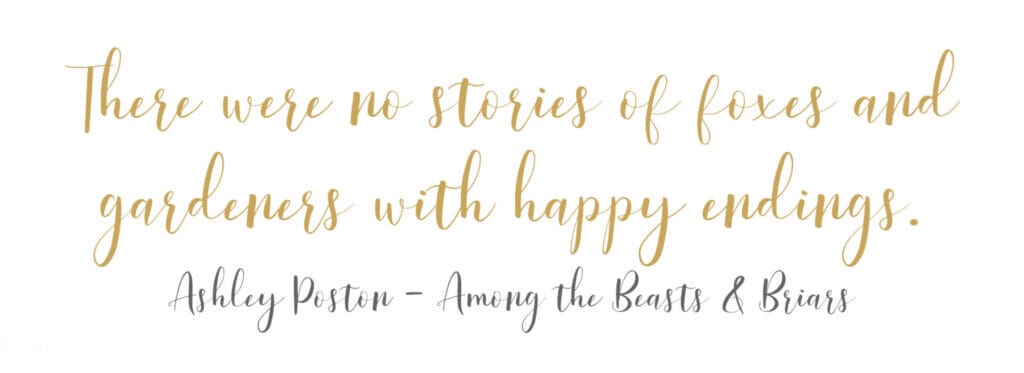
One thing I’m hoping to start doing again in my own reviews is adding my favourite quotes in fonts that match the general theme of the stories (I haven’t done it since this post here).
For the sake of the focus on this post being the fonts themselves, I’m not going to add quite as much in terms of backgrounds, but I picked out a couple of fonts from Font Bundles’ free font bundles and basically had a play around to create some quotes with them.

For those of you looking at this thinking ‘why would you go to the effort of designing this in Photoshop or anything’, here’s a top tip for you – if you call the image the ‘Quote from [Book Name] by [Author]’ or something similar, then our lovely friend Google will basically really like this and it’s an extra bit of help for you. Additionally, it can highlight your favourite quotes from the book itself and make them really stand out.
And… it looks pretty. Yes written content is the most important thing in a review but wouldn’t it be refreshing if there was just something that popped on the page?
I’m planning on going back over a few of my posts without this and adding quotes just like the one above.

Featured Images
Now this is something I myself have chose to forego this year, instead opting for just photographs I’ve taken as much as I can. This is a personal choice though and really I’m just doing it because for me photos are important with photography being one of my favourite hobbies.
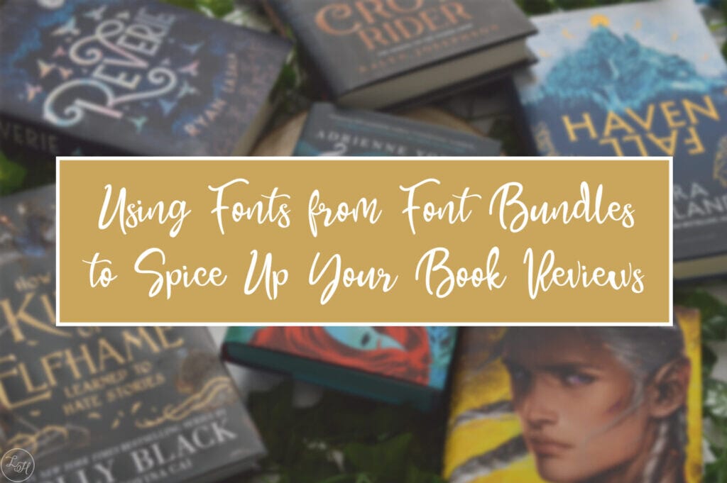
However, if you were looking for something more uniform then the right font can make all the difference. I had a little play around in Photoshop and that’s why this post does have some words on the featured image. I used the free Pearlye font here and I quite like the end result!

Again, even with featured images you can add names and alt text to help with your SEO. Just don’t go crazy filling it with all the keywords because if it doesn’t make sense then Google will mark you down for that!
Pinterest Images
I have been on Pinterest for about 4 years now, at least. But I’ll be the first to admit that I’ve never really used it the right way up until this year. (As a result of that, I’ll need to go back and change god knows how many posts so I can pin them up properly!)
It can be a super big asset though so it’s well worth making sure your pins will stand out, and again… fonts are a great way to do that!


The first of these uses the LovelyBarthy font again, the second Cardigan Script and the last Aventure Scriptine.
For a fantastic example of a blog using Pinterest to gain views, check out Goats On The Road (as featured on The Independent).

Blog Headers
A final way you can spice up your overall blog, regardless of the type of blog you have, is by changing up your header. It can be a great way to make a huge change on your site with very little effort.
One thing I’d suggest though is to be careful, you don’t want to change your header too often because then people could get confused. Treat your blog as you would a business and aim for consistency and recognisability.
I actually very recently changed my own when I changed the entire theme on my site, but that didn’t stop me from having a play around with some of the fonts available for free!


In all honesty, if I hadn’t changed my header so recently I’d be very drawn to Pearlye myself, I love the flourishes on it. All of these fonts though are just so nice to look at that I’m pretty amazed they’re just available for free! LovelyBarthy will probably be one that I use going forwards for my favourite book quotes but any of them would be a pretty good choice really.

I had a lot of fun playing around with all of these fonts, I’m definitely most drawn to LovelyBarthy on the whole but there are so many others you can choose from on Font Bundles’ website! Of course they also have some lovely fonts which are available if you pay for them, including some gorgeous fancy fonts here. They look like they’d be just as fun to have a play around with! (There’s even a dinosaur font there, which I’m particularly fond of for geeky reasons.)
 If you enjoy my content please consider supporting me through any of the following:
♥ Ko-Fi — Bloglovin’ — Facebook — Instagram — Twitter — Wishlist ♥


Leave a Reply